So, if you go to the root element, you’ll see something like this:

The blue background is the current month, and each bar shows the plan for a project. Your current time is probably different than mine, and therefore, you will see a relatively different chart. Feel free to change the start date of your projects to match the current date.
In this image, the bar for the process plant project is too long to fit the diagram, but the other one fits. The chart view of the organizations and portfolios show a fixed scale around the current time, but the chart view of the lower levels adjust automatically to show everything. This is because projects and their deliverables are temporary and have an end, but portfolios and organizations are not bound to a start and end date.
There are not many items here at the moment, but when they grow in number, it may be difficult to understand the structure if it has multiple levels. In that case, you can limit the maximum number of levels using the maximum depth control. The image above shows 3 levels, and when you select 1 as the maximum depth, you will see this:
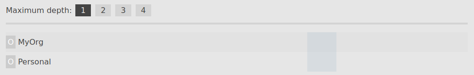
Because of the nature of organizations and portfolios, no bar is displayed for them.